The hip-hop industry has gone through some major changes over the years, but we still have the music and something just as important: the imagery. The hip-hop stars of the past paid much attention to their logos and their album cover art. It was art, not just Photoshop like today. So let’s take a look at some of the most powerful logos in the history of hip-hop so far.
1. Nas
If you are a New-York rapper named Nasir Jones, how do you want your logo to look like? Just as epic as this one, right?
2. UGK
It first appeared on their second album, “Super Tight”. It’s a self-proclamation of the Kings and that “Kingz” tells the story of the underground kings
3. Hieroglyphics
Much like our today’s emoji, right? Only this one has three eyes and you don’t know which to listen to, so it’s a hieroglyphic.
4. Diplomats
A vulture with a message: “We are the diplomats and you shall listen!”
5. Gang Starr
It first appeared on the album Step in the Arena and stick with them ever since. It’s a simple message, but really effective.
6. Naughty by Nature
A really cool, hand-drawn style logo that does the job well. It looks like a kid has done it and the confusion is clear here. Is that kid keen on baseball or beating someone? Are they the good guys or the bad?
7. Public Enemy
One of the most powerful images in all the hip-hop history of music and logos, this logo symbolizes America’s problem and fight with the Black youth. The man who is under fire is a real person, Damien Earl “E-Love” Matthias. Public Enemy basically made their statement clear from the logo. What can you wish for?

8. EPMD
EPMD comes from something you might not expect: “Erick and Parrish Making Dollars”, a self-proclaimed business goal in music that was perfectly matched by a logo worth millions. Nothing personal, just business.
9. Run-DMC
When you are already superstars and kings, your logo doesn’t need anymore bells and whistles. What it needs is clear letters in white on a black background and two red lines to make the point: Run-DMC is around and you shall all bow before greatness. And let’s face it, this is a design that has been revisited by many others so far.
10. Wu-Tang Clan
What do you see in this picture? You see a stylish “W” which can also turn into an “M” or a “G” or a “U”, depending on its masters: GZA, Method Man, Masta Killa, U-God. This is a complex logo which can do its duty in a perfectly easy and elegant style.
11. Ice Cube
This design was inspired by the ICU, a machine used to monitor a patient’s vital signs in hospital. Ice Cube was dead serious with this logo which he debuted on his “Death Certificate” LP cover. He was making a point.
12. Ruthless Records
This is a logo to remember. It’s got incongruous letters that dance on a sheet of music and promise stormy things to come.
13. S.O.U.L
SOUL also known as Sound of Urban Listeners seemed like a good thing from the very first time you heard the name. Ex Def Jam and Bomb Squad guys, Hank Shocklee and Bill Stephney promised big things wil SOUL. Even though they didn’t happen, their elegant and urban logo still remains one of the best in the hip-hop history.
14. Pete Rock/Soul Brother Records
Classy, so classy you can’t really get anywhere near that nowadays. This afro-dude with that afro-pick looks memorable, statuesque and bound to create a legend. *Sigh* They don’t make logos like that anymore!
15. N.W.A
The World’s Most Dangerous Group, aka Niggaz wit Attitudes had a pretty straightforward, no-bullshit kind of logo that speaks a lot about their creed.
16. Bad Boy Records
This is aggressive, disturbing, but so good in a very hip-hop way. If you were a fan of hip-hop, this was the right logo for you!Back then, people had some balls.
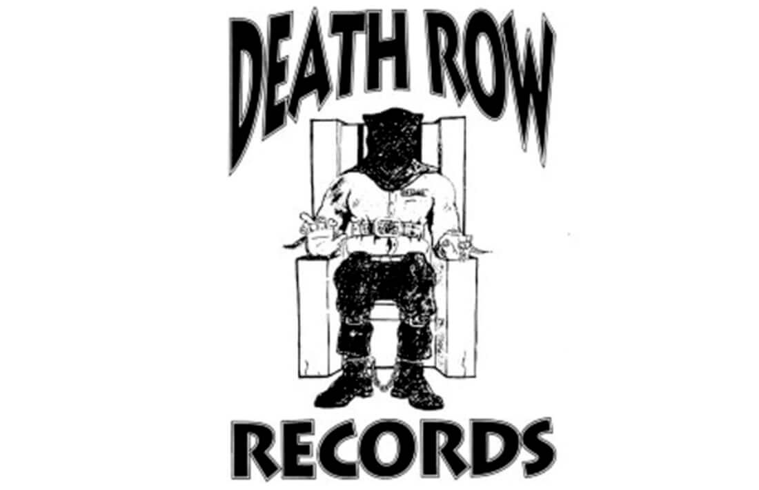
17. Death Row Records
This is a quite morbid logo that you wouldn’t really want to hang on your walls (although we know there are some who did just that). The message is clear: This is a record label you shouldn’t fuck with. Probably this is why hip-hop artist like Dr. Sre, Snoop Dogg or Tupac Shakur loved it.
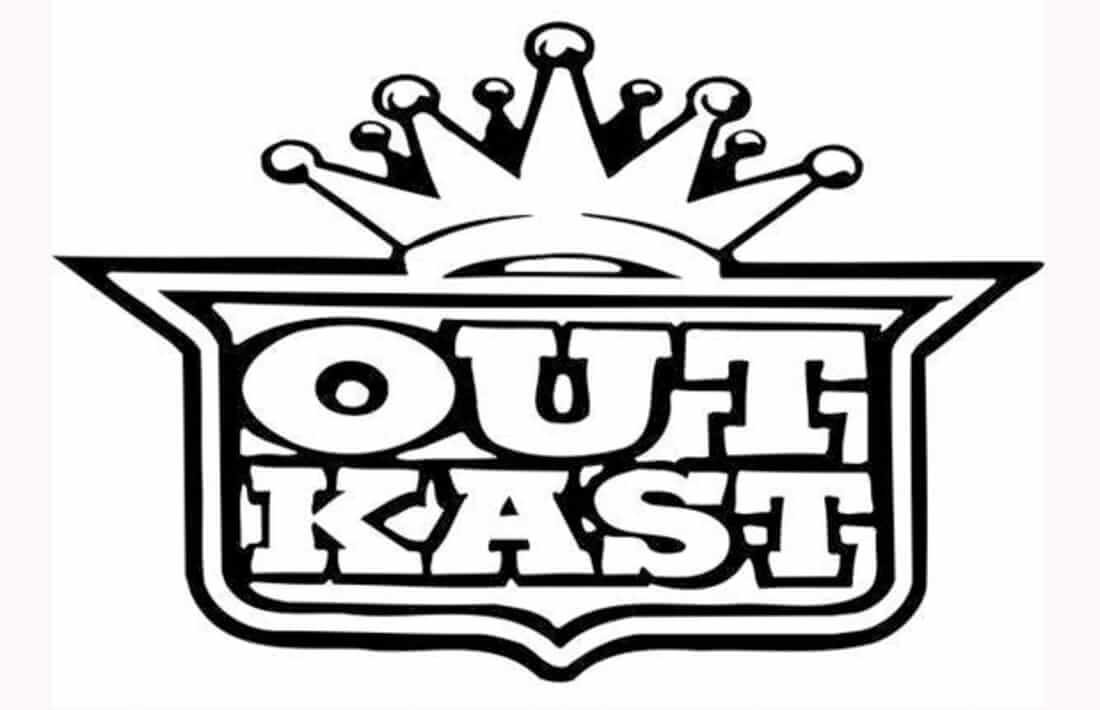
18.OutKast
Outcasts, but on their way to become kings- this was Dre and Big Boi’s self-proclaimed motto and they were right about it.
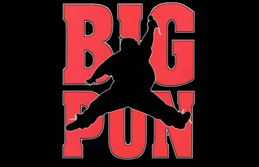
19. Big Pun
A big Pun that is actually light and slander in his Michael Jordan signature jump to slam that ball down the net. Only Big Pun did not slam the ball, they nailed the mic
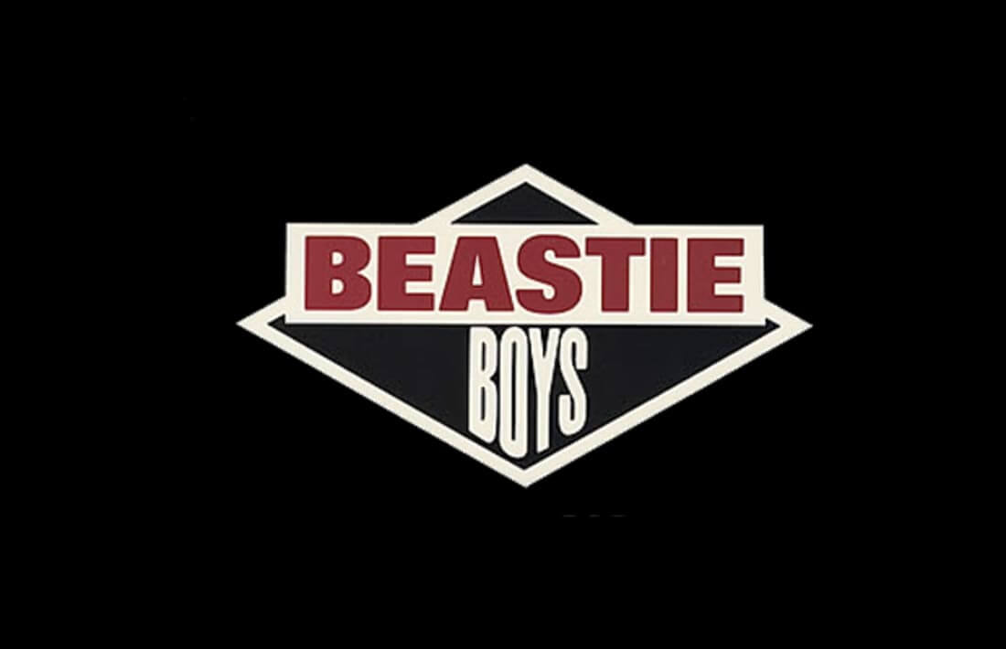
20.Beastie Boys
The Beasties have been always one step outside the box and their logo is just like that: different fonts and shapes that tell the tale of an unconventional band that brought harmony through their music.
Sure there are a lot more Rap labels logos out there, but we shared some of the best, if you love logos, check out this post about famous logos with hidden messages

